Animations have endured for a long time now. Each animation in an interface tells a micro story, and as a user encounters more and more animations throughout your site or product, these micro stories add up to reveal the personality and story of the brand or product behind them. The animations create an impression; they give your brand a certain personality.
They can enrich interaction and clarify interfaces. But what are micro-animations anyway? And how are they an advantage?
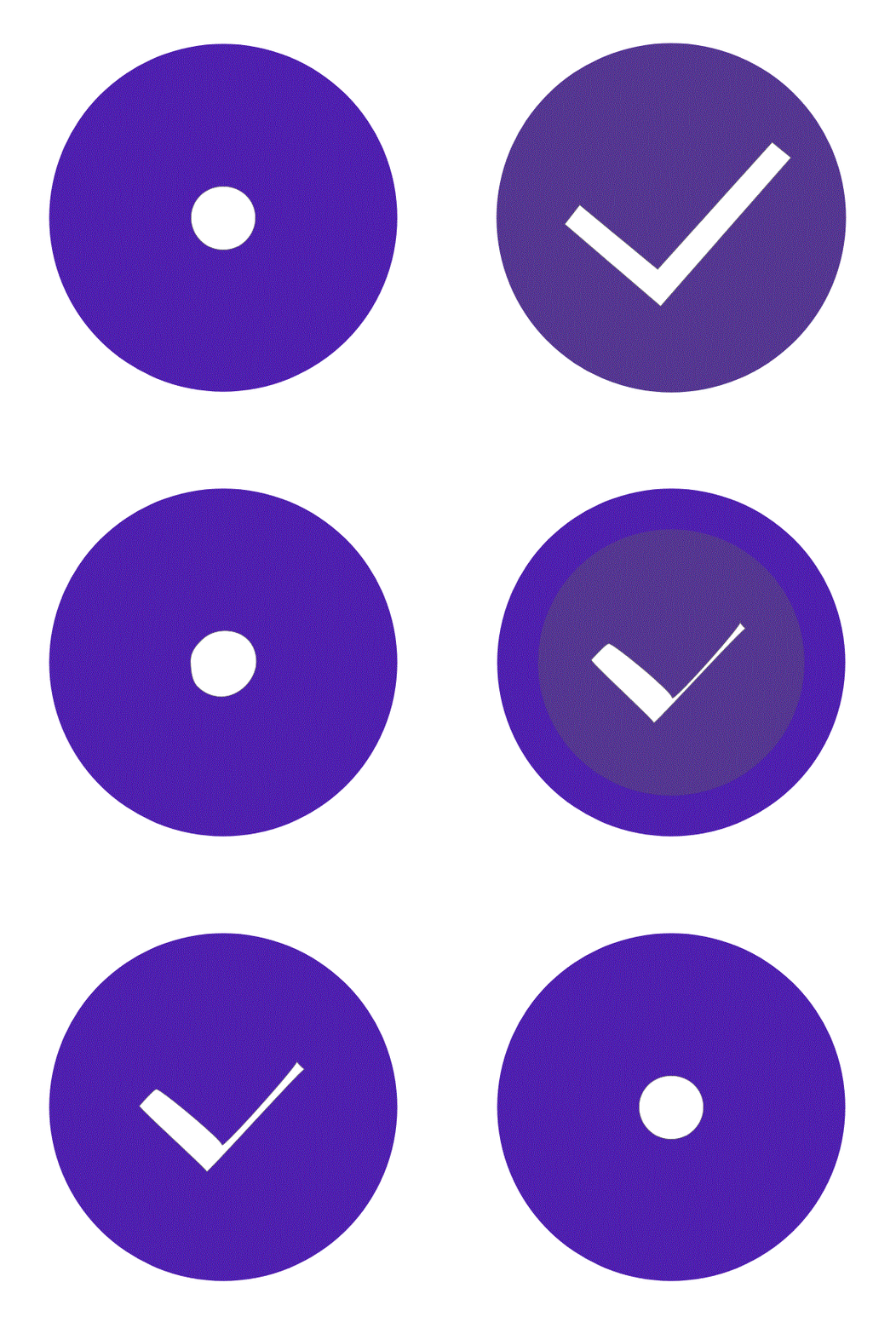
One of the greatest joys of using technology is gained through user empowerment and engagement. An enjoyable experience means more than just usability — it needs to be engaging, and that’s where micro and animations can play a major role, by positively contributing to the look and feel of a product or service.Micro-animations are small, preferably functional animations that support the user by giving visual feedback and displaying changes more clearly.
Micro animations can improve a product’s user experience by:
• Encouraging engagement
• Displaying system status
• Providing error prevention
• Communicating the brand
How to land micro animations in projects?

Intuitive interfaces
By using micro-animations the user gets support in understanding the hierarchy so elements are placed in context. This creates focus. The user gets a sense of direct interaction because they see something happen directly.
Clarify change and context
Especially with small screens and flat design, it’s an art to show all the necessary information.
Because of this we sometimes hide elements. For instance, to clarify how to navigate, micro-animations can be the solution.
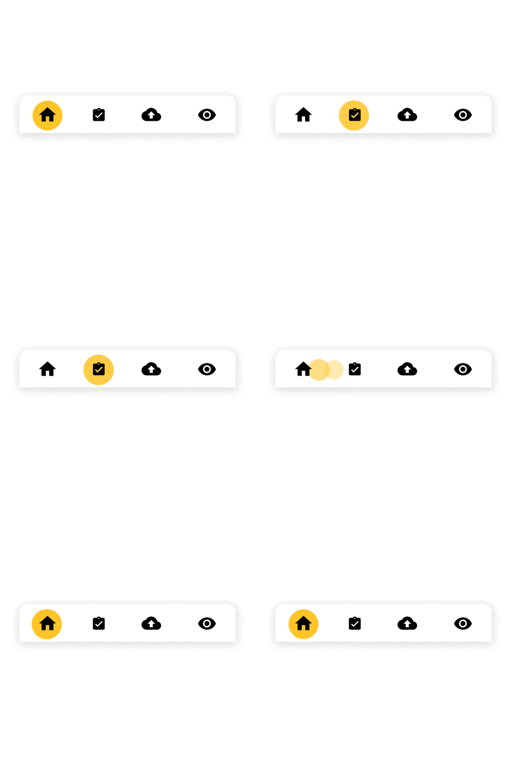
Hierarchy & Focus
Creating focus is one of the more important reasons to use micro-animations. Something that moves, attracts attention. So you can ask for attention by animating a certain element. This can be really useful during an on boarding moment. Emphasize the button you want the user to click to start an action on the page.
But be careful, by using too many animations you will only flatten the hierarchy. It will tone down the message you are trying to communicate.
It is very important to make our UI as friendly and simple to understand and cover all areas aptly. If there are any limitations in our Menu, then the user can be notified the same. Using animations will make our UI more attractive. For example, while using the Forms section we can have animations at appropriate places as Flags to indicate what we mean to say.
Try and keep forms as short as possible. This way it won’t scare the user away by presenting them with unnecessary information. It is preferred to skip form field titles to get a form that’s as clean as possible.
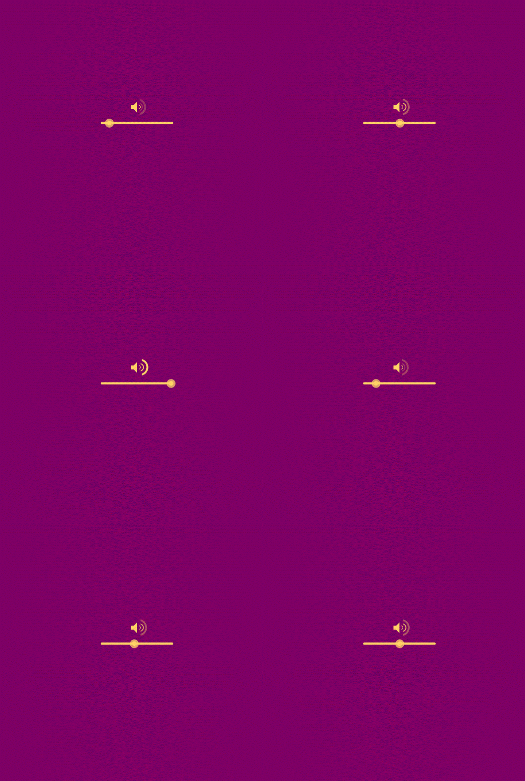
Take a share-option. Before you think of sharing an article, you might not think about whether you’ll share it on Twitter, Facebook or LinkedIn. But once you click or hover the “Share” button this becomes important.
Direct influence
By using animations you can increase the sense of direct influence. When the effect of an action is directly visible, you know you can influence it. Think about swiping or dragging elements of an interface for instance. But also pulsating buttons and other animated hover states.

Rewards
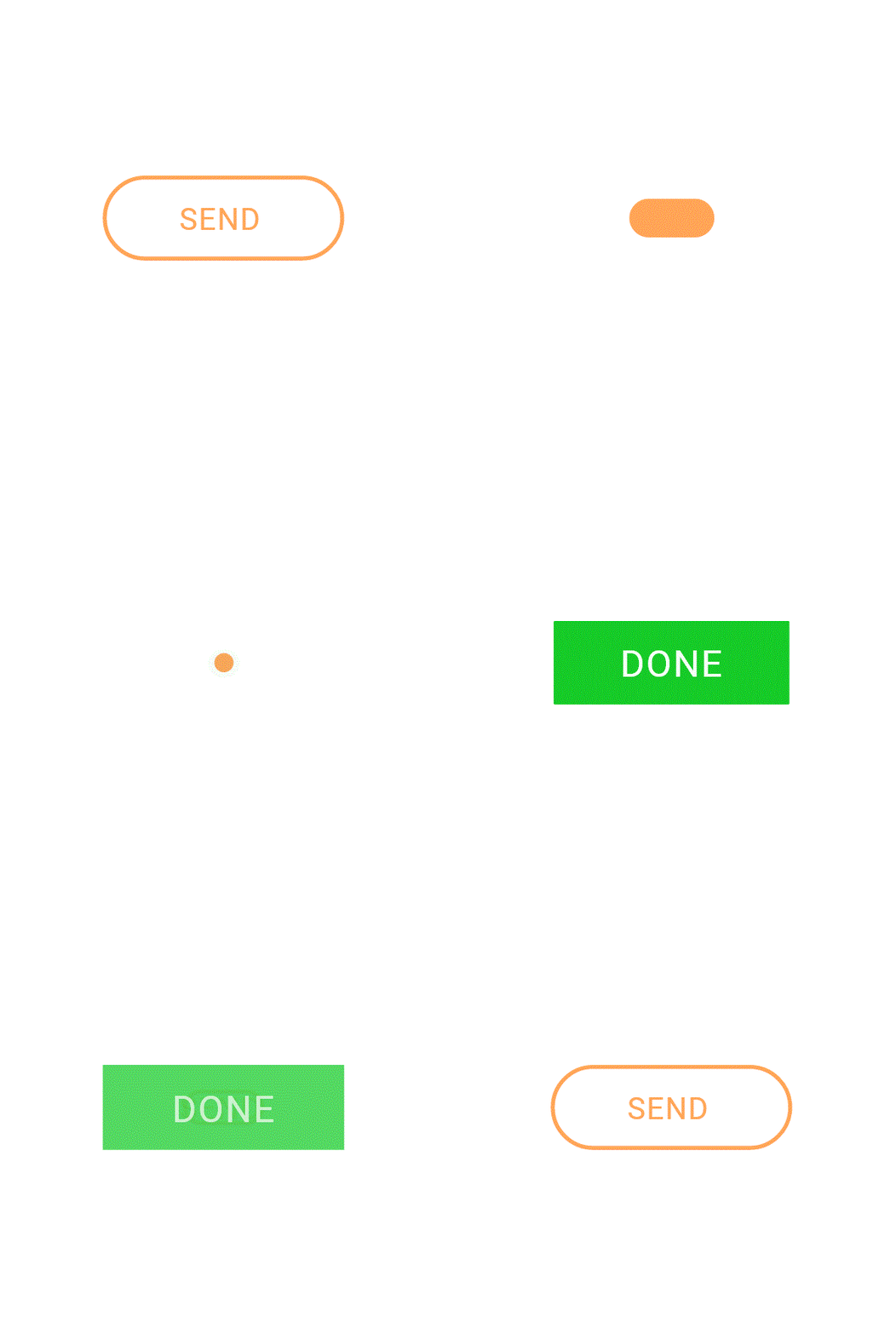
Micro animations can act as a form of reward for an action completed — it should not be something that goes overboard, but should act as a form of validation for the user, letting them know they’ve done something right — think a small animated thumbs-up, or an animated tick on submission of a form, or a “success” indicator like this survey submission message.
To reward a user you can use small animations as well. For example, by showing a small animation when a user completes a form. Rather than creating a cartoon, but use a micro-animation like an example below:
Brand experience
Animation can be a way to reinforce your brand experience. Your design gets more character by implementing micro-animations. Using micro-animations is one way to enhance the brand experience. This type of animation is more to do with emotion rather than function, but it can increase the emotional engagement of the user with your brand. It offers a point of difference and allows a brand to showcase its personality, what sets it apart from competitors and makes it unique.
A beautiful example of this is the Google logo. They use their 4 colourful dots for the speech recognition tool to communicate different statuses like waiting, listening, processing and answering.
To summarize, micro-animations are an important part of digital design project. For efficient micro-interactions, designer has to think about the design, psychology, programming, human activity etc. With thorough analysis of the target audience and their activity, the designer can design micro-interactions which make the user-interface to be more stylish and usable.
When using micro-animations in your interface you can make it more intuitive. Because of that, you enhance your interface. Use the animations to give feedback, to create focus and hierarchy, but also to enhance your brand experience and to give your design more character.
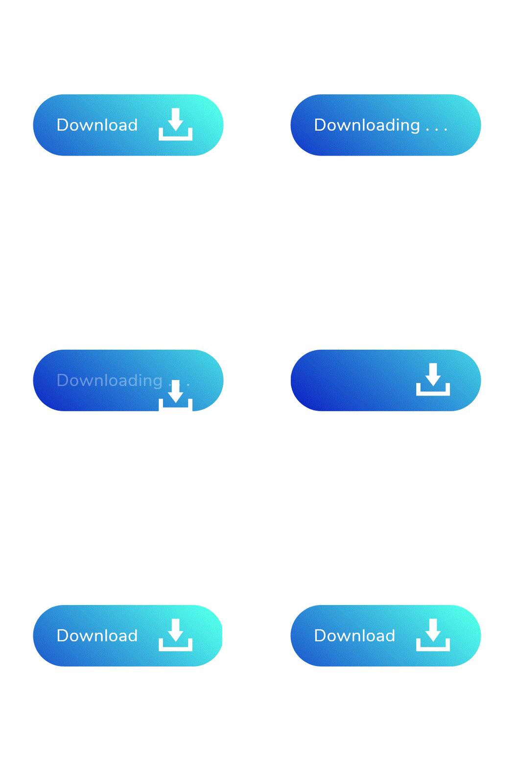
Micro-animations have the potential to turn any app or website that utilizes them well into a well-crafted, enjoyable, perhaps even a memorable experience for the user. A good site should be designed with usability and functionality in mind from layout to navigation, and animation should be used to fill in the gaps. Designed and used well, they will serve to enhance user experience, and in turn, create a positive sentiment toward your brand.
We can help with your animations. Visit for more details https://www.exdera.com/
