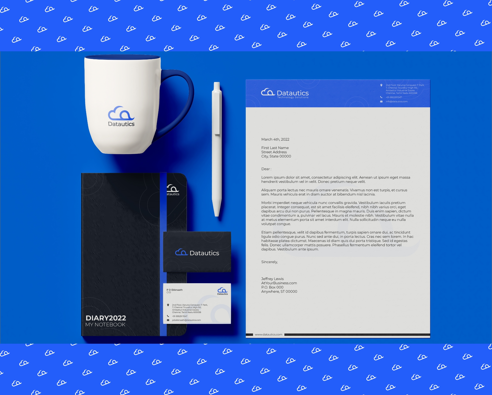
Datautics
Datautics, an IT services company, is inspired by the idea of necessitating holistic IT infrastructure transformations using cloud, effortlessly. The objective of the company is to utilize leading tools & breakthrough cloud technologies to transform how businesses compete with their peers and advance.
01
Client Requirement
Brand Creation/Consulting
The Brief
The client request was to create a brand logo that depicts the Datautics mission. An identity to depict their unique ability to enable their patrons with tools & expertise necessary to build a thriving technological empire, seamlessly.
02
Logo concept
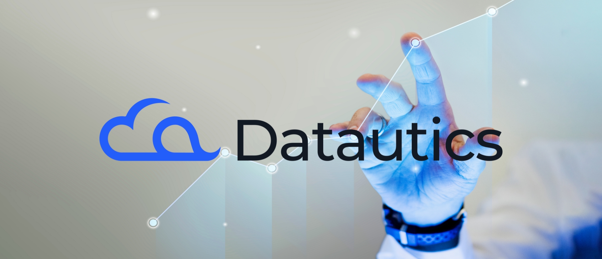
As Datautics primarily specializes in cloud led technologies & services, incorporating a cloud element that reflects the same was pivotal. We designed an element incorporating the cloud, complete with the lowercase alphabet ‘d’ placed sideways on the left corner representing the company name.
A simple & clean-looking font is integrated with the main element to complete the logo. Ensuring high readability, this versatile font represents the brand’s ethos effortlessly.
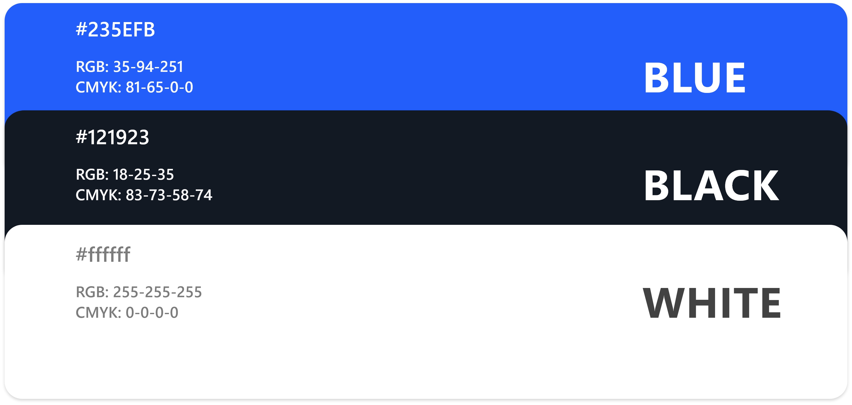
Color stimulates all senses by delivering a message instantaneously. A blue palette was the evident choice considering it illustrates strength, reliability & responsibility, three of the most important characteristics for the business & industry that Datautics is a part of.
Once the branding was done, the time had come to
