Greater Chennai Corporation
01
Client Requirement
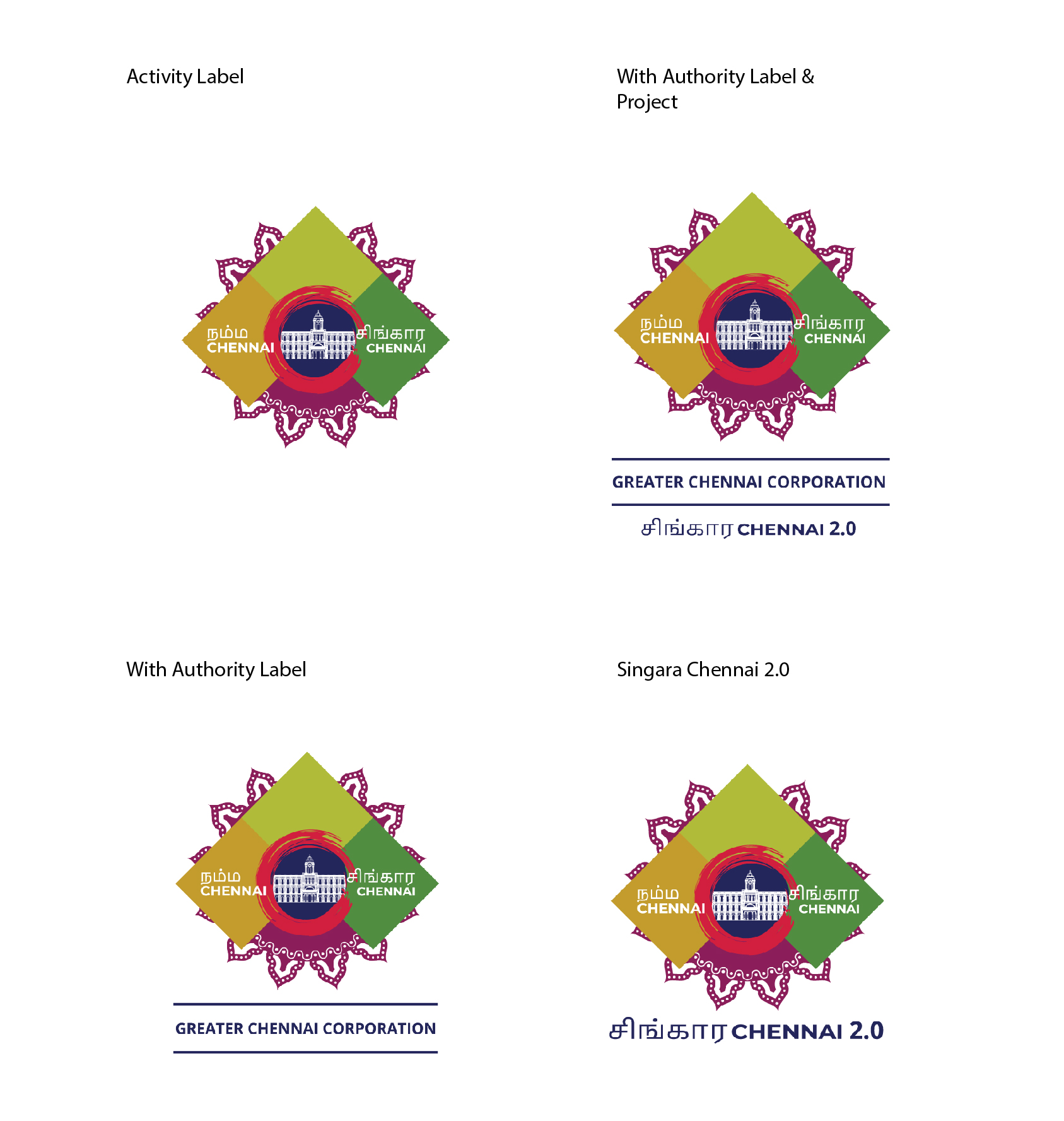
The Greater Chennai Corporation wanted to rebrand their pre-existing symbol by creating a brand-new logo design for their sector.
The Brief
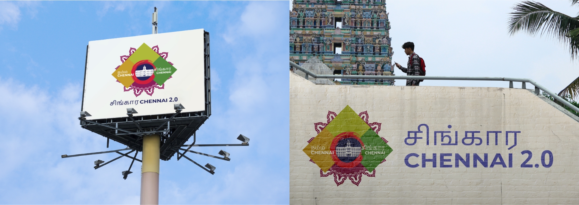
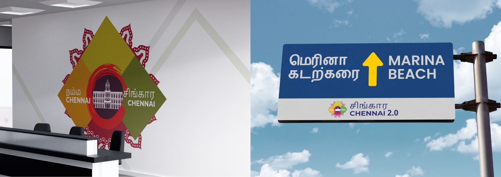
The client wanted to revamp to a more up to date logo for the people residing in the Chennai city area. They wanted this logo to promote their city.
02
Logo concept
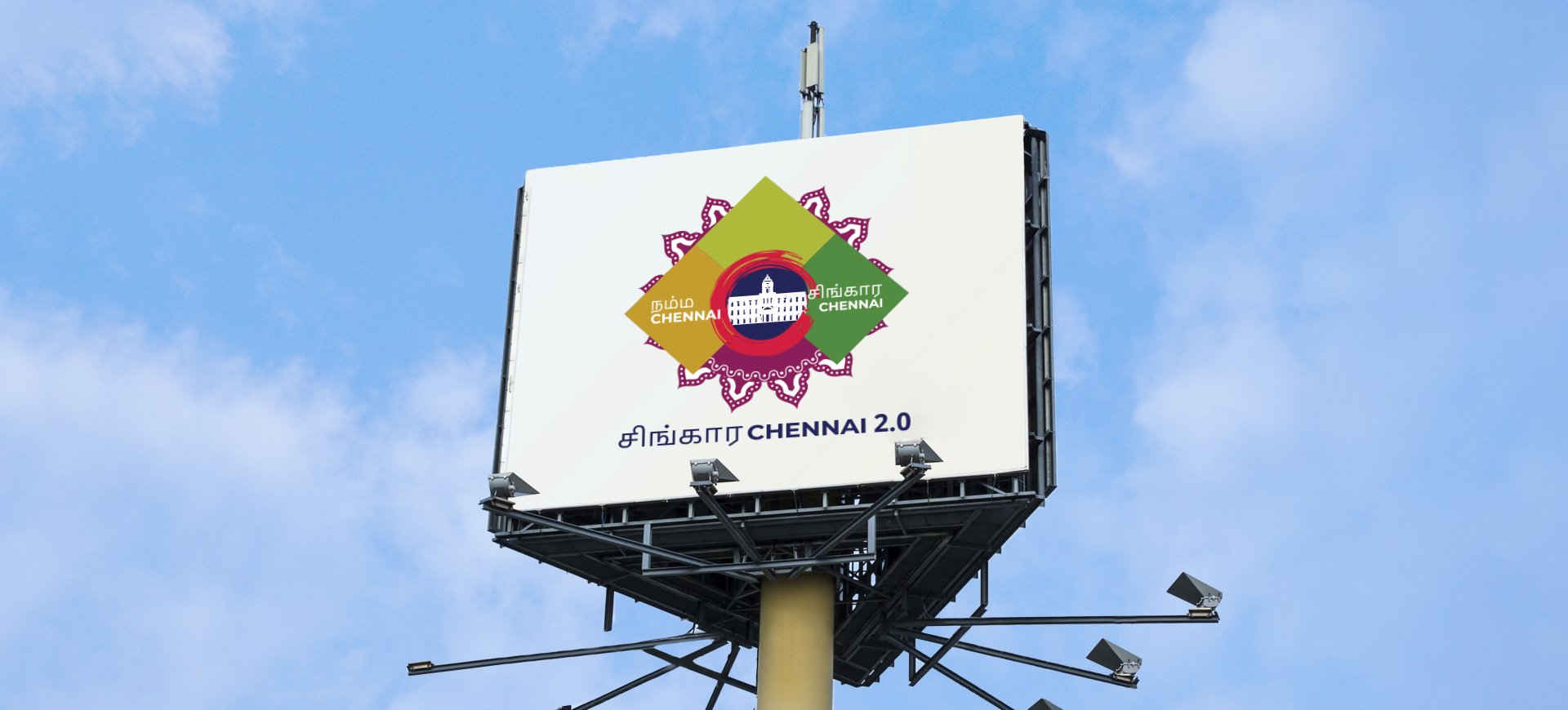
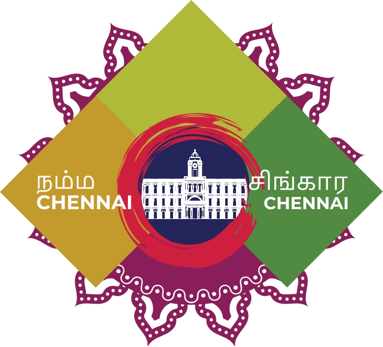
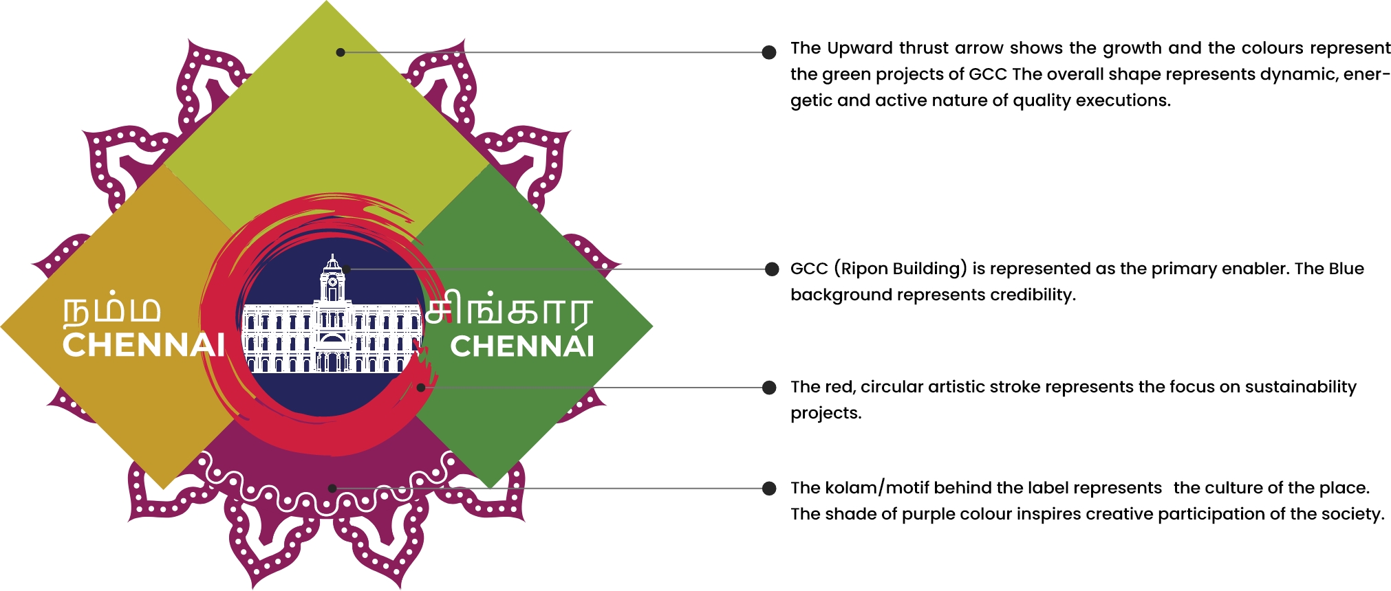
We designed the logo in such a way that it incorporates the main features of the city and the sentiments of the people living there. At the centre of the logo, we have used the outline of the Ripon Building which is currently the Greater Chennai Corporation’s head office, is represented on a blue background that represents credibility and liability of the governing body.
The circular red artistic stroke represents the focus on sustainability projects. The Kolam/ motif behind the label represents the culture of the state, in the shade of purple that brings the sense of creative participation in matters concerning the society.
- We also provide the branding guidelines and templates for the social media posts for the events that are headed by the Greater Chennai Corporation.
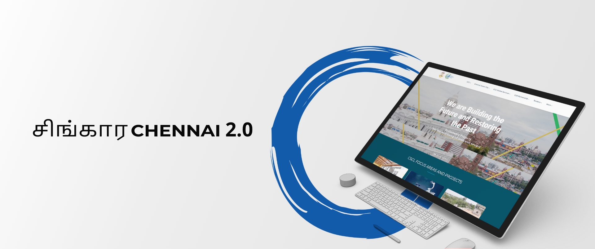
- Designed a vision book and brochures for the Singara Chennai 2.0 project that will be releasing shortly.
Once the targets were defined, the time had come to
